
It’s not a great surprise I imagine, given my musical tastes as documented on VersionCrazy, to realise that I like much of the design work by Peter Saville. ‘Estate 1-127’ is the second book solely dedicated to his work that I bought, the first being ‘Designed by Peter Saville’. That had coincided with a retrospective exhibition at London’s Design Museum in 2003, ‘The Peter Saville Show’.

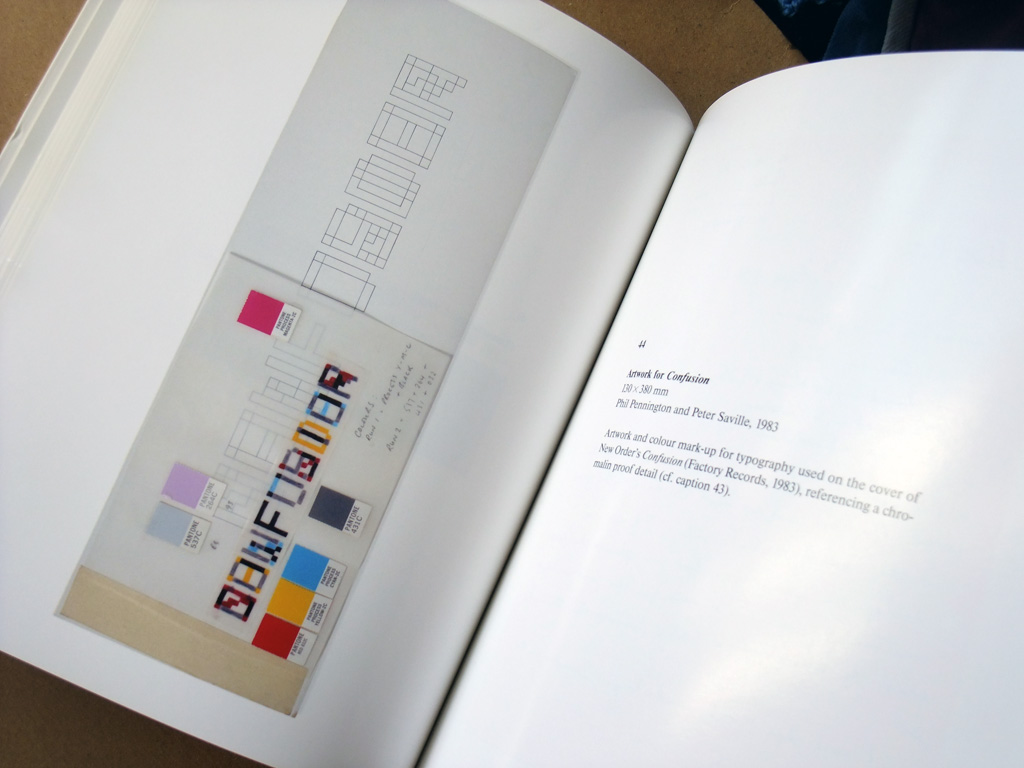
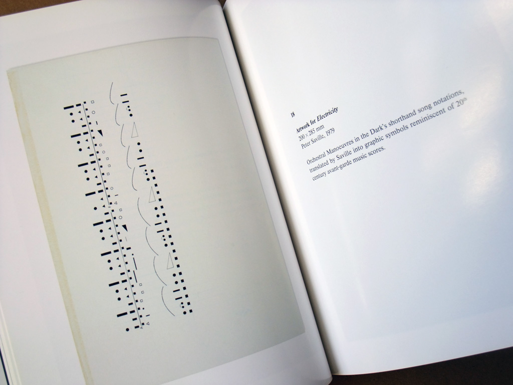
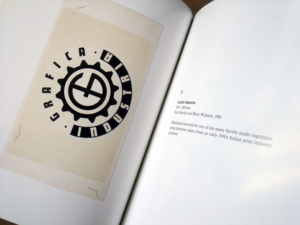
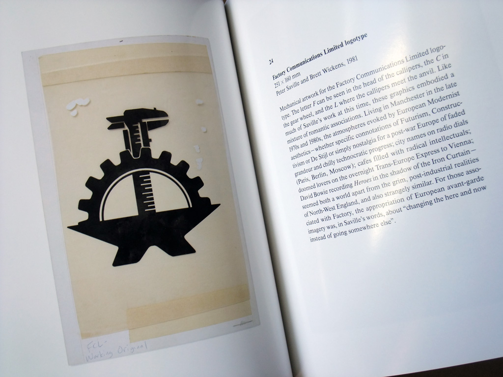
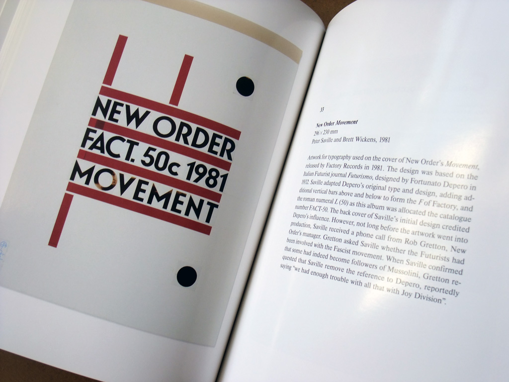
The two books are, on the surface, quite similar in approach and equally valuable if you have an interest in his work. ‘Designed by Peter Saville’ goes heavy on the essays from a range of writers and features full page, beautifully shot photographic examples of finished, designed product along with smaller sized background source/inspiration and accompanying materials. ‘Peter Saville Estate 1-127’ was published in 2007, two years after the ‘Estate’ show itself at Migros Museum für Gegenwartskunst Zürich, Switzerland. The crucial difference is that in this book, you get to see far more in the way of the working processes behind so many iconic designs rather than the finished works themselves, whether that be logotype paste-ups, work-in-progress drafts, manufacturer samples or Pantone colour swatch cut outs. Each is accompanied by captions written by Frieze magazine’s Dan Fox.
I’ve featured some photos of a few recognisable examples here that highlight the traditional paste-up approach used in the process toward creating the beautifully finished final products, a fascinating glimpse into a working process that was commonplace once but has long since gone in the era of computerised design work.
The good news is that the book still appears to be in print and available from the Museum shop if your appetite has been whetted enough.
It’s a small detail, but it’s interesting to note how Savilles’s design work for Ultravox is effectively written out of the history across both books, given how much work was done for them. Thank goodness for sites such as Peter Saville Sleeve Design for documenting the many and varied works over the years.
I also have this one and you make a very valid point that his work for Ultravox, is almost completely swept under the carpet in both books, in spite of being a a consistent thread of many years for both Ultravox and Ure solo.I put this down to the lack of critical consensus for the music of Ultravox. It will never have the critical cachet of Joy Division or even New Order. Or even his OMD work. I think it’s seen as near-kitsch due to the popular success of “Vienna.”
When Ultravox came calling in 1981, Saville had been on record as a fan of the earlier Foxx band. It was Chris Cross that suggested using him after seeing the early Joy Division work. I maintain that the biggest unspoken influence on Saville’s aesthetic was the John Foxx designed cover for “Systems of Romance.” Examining that is like seeing the next half-decade of Saville design that had not even begun yet, and even beyond as he also began using stock images by the 90s. The Jan Tschichold classic serif typography. The deconstructivist use of printing codes. It’s all there; pointing the way. For me it’s the Rosetta Stone of Saville’s art.
As a graphic designer who came up learning “on the boards,” I feel that the computer has cheapened the experience of designing and led to a mediocrity of design. My two favorite designers [Malcolm Garrett and Peter Saville] have effectively not created any material I would deem classic since moving to computer-aided design in the late 80s.