
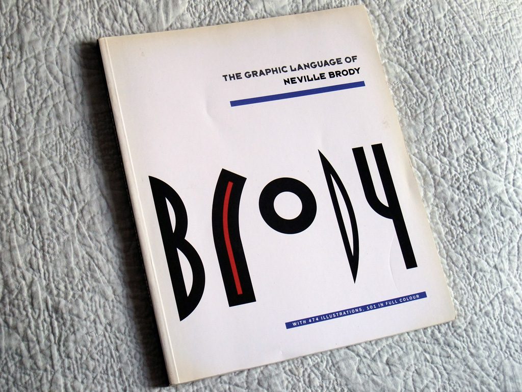
As charity shop finds go, this was my best one in a while. The edges a little discoloured, fair enough… but for the price, no complaints. Neville Brody’s work has spoken for itself for many decades now and this book, dating from 1988 (there are later editions too) is an excellent display of his craft and thoughts, some of which are recounted below. Inevitably, I’ve focussed on the Cabaret Voltaire element for this post, but the book obviously covers in fine detail the broad scope of the man’s work up till the 1988 publication period in this case.
With text by Jon Wozencroft, the introductory piece nails a few points quite crisply (bold text emphasis is mine):
Since the early days of The Face’s success, Brody’s graphic work has been widely imitated with scant regard for his original intentions. This book sets out to restate these intentions, whilst staying conscious of both the advantages and the pitfalls of hindsight: Such clarification is necessary; whether fact, belief, gossip or opinion, all information in the media has become interchangeable and based on disposability. When style rather than content is the driving force of a culture, as it is today, it requires a keen eye to differentiate the original from its countless simulations. ‘Signification’ has become a habit – in design, it is an easy way of appearing to share a common language without avail to any meaning except its commercial familiarity. Since Brody has never sought to make his work obscure, it becomes even easier to replicate; its ideas have then been codified and represented through those codes alone. The Graphic Language of Neville Brody tries to reveal their hidden trace.
Much included in the book I had never seen before, hardly surprising since I was nowhere near the regions of the likes of ‘City Limits’ magazine, it it’s good to see example of the unmistakable signature styles there. ‘The Face’ gets a good outing and deservedly so, quite iconic and good to see so many examples again.

On his study period at the then London College of Printing, some insightful reflections:
I had set my own brief at college. I complied with the curriculum requirements because I needed the chance to explore those ideas too. I was acutely aware that this was the only time I was likely to get to follow ideas before having to go out and look for work, where I’d have to think on my feet. Employers certainly wouldn’t let you spend three months studying a photographic process, and if we did, we’d starve. The whole art college system collapses when all members of staff are full-time, and when they fail to recognise that it is not they who have to go out and find a job afterwards. They fail to recognise the need to help develop a student’s individual talent. Instead, everybody is moulded into an expected way of being; colleges aren’t geared towards producing pioneers but gauge their success on professional imitation. If tutors said they liked something that I was doing, I would go away and change it, because such approval then made me think there must be something wrong with the work. I think that was a very positive and healthy attitude to take. I hated my time at the LCP, but I value it. I cannot emphasise how important it is for people to be encouraged to explore ideas, and then to be encouraged to work on them. One of the results of recent staff cut-backs is that students are left to swan around, they’re not pushed, and it’s not right.
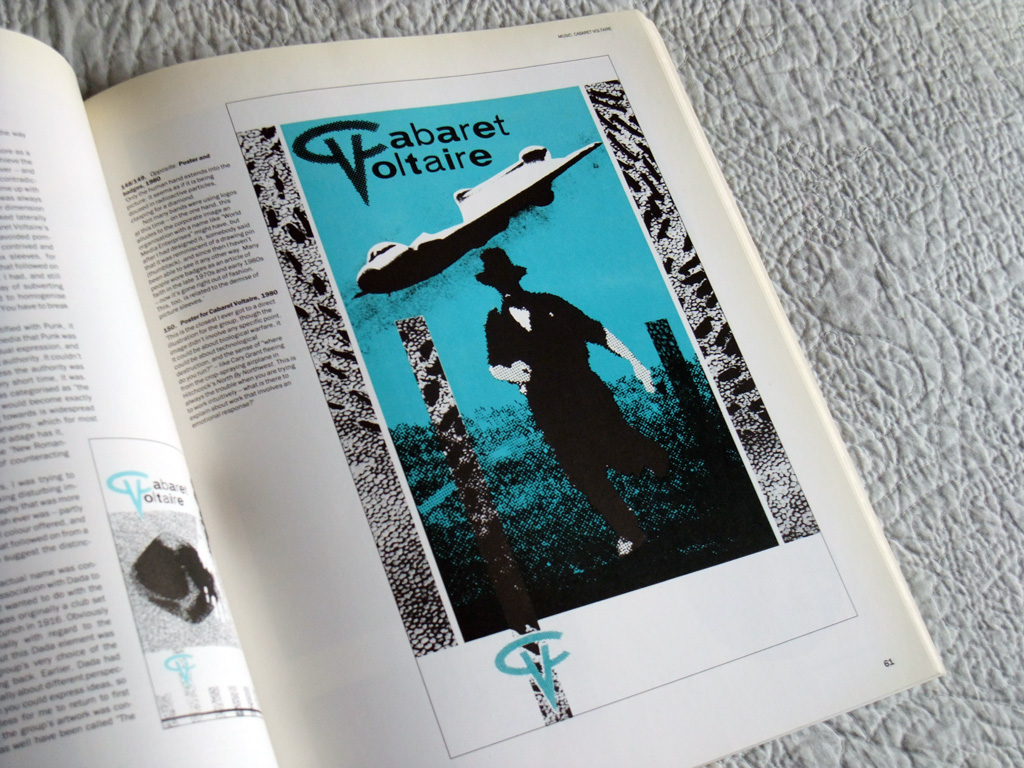
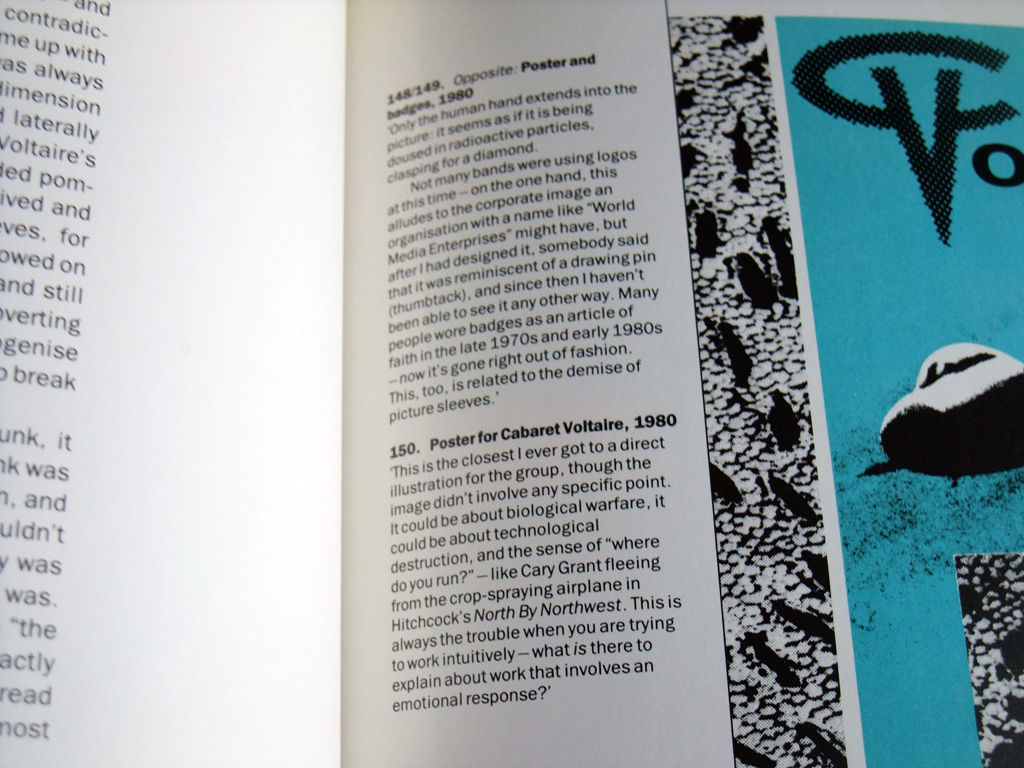
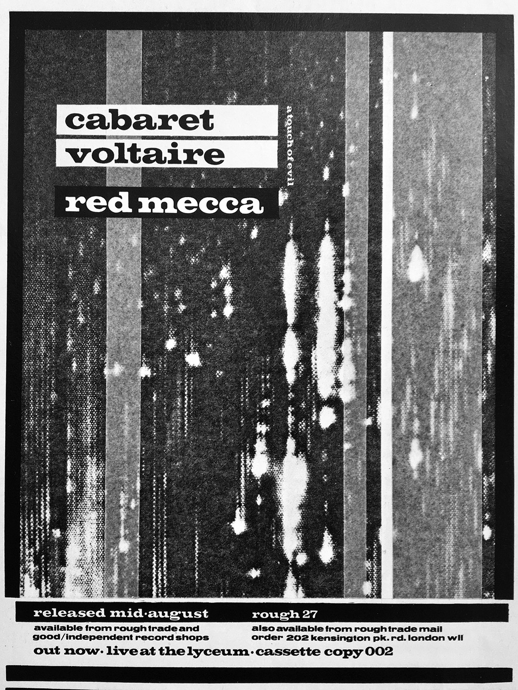
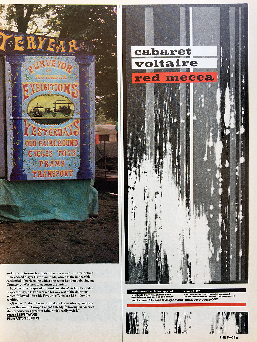
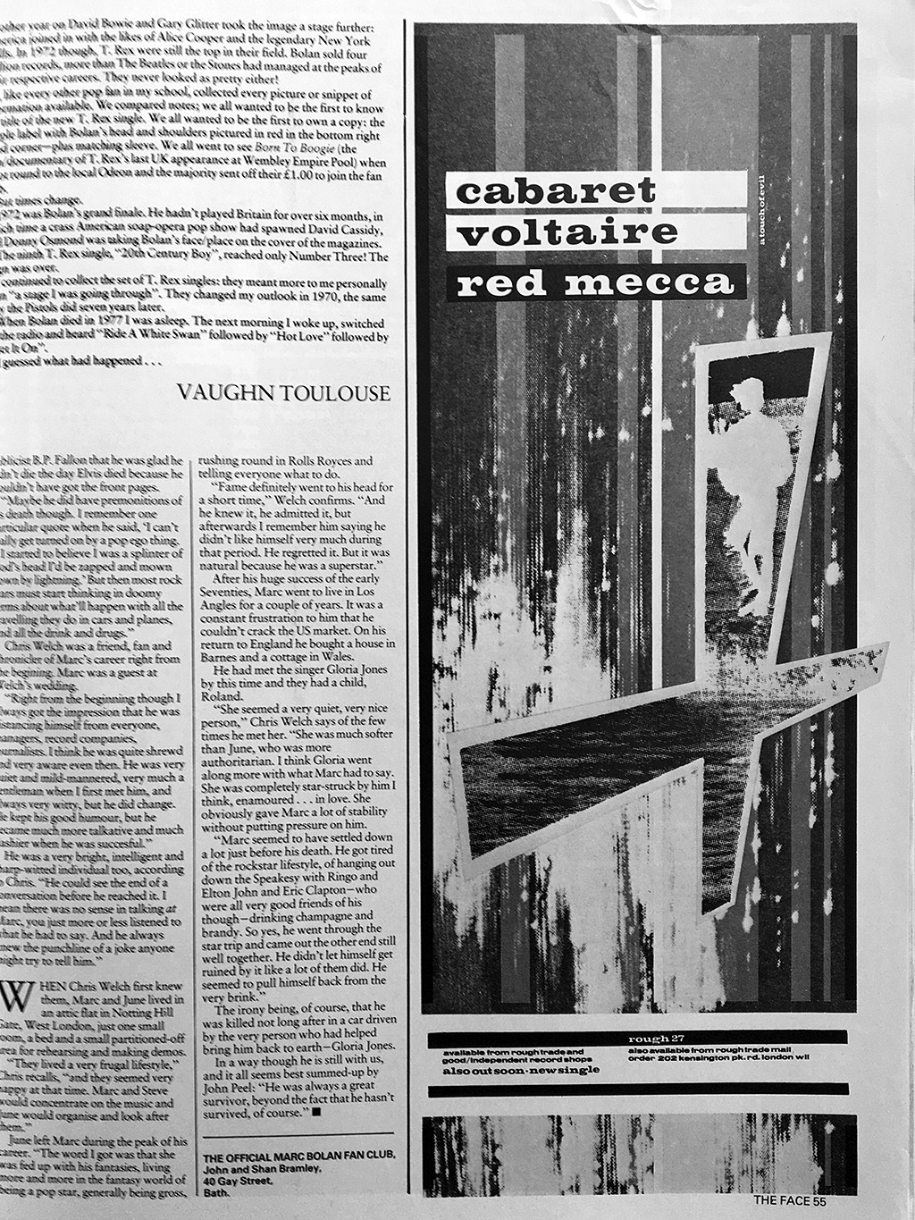
Reproduced here however is a few of the pages that feature work done for Cabaret Voltaire from the book, supplemented with additional press adverts from The Face magazine as well that I have scanned, some of which aren’t featured in the book.
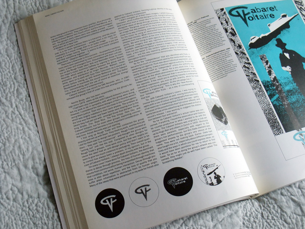
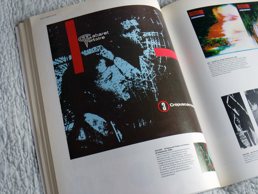
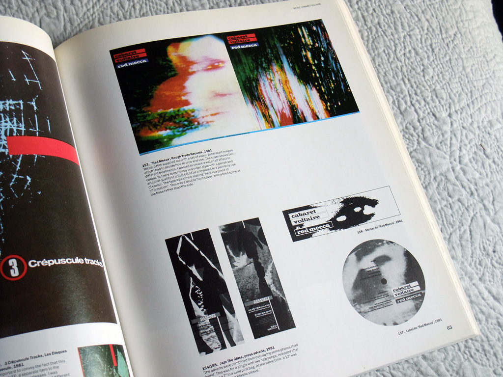
In fact, it is quite something to see the various iterations of the ‘Red Mecca’ period design and realise what might have been had some of these works been utilised for the ‘Jazz The Glass’ and ‘Eddie’s Out’ singles of the era. A missed opportunity.
if you missed them, before, some of the Cabaret Voltaire button badge designs are to be found in a previous post.
The above page spreads are just a tiny fraction of what is to be found in the book – and the book itself isn’t even exhaustive (there’s no space or reproduce Stephen Mallinder’s ‘Temperature Drop’/‘Cool Down’ 12” or example, one of my favourites). If you have an eye for Neville Brody’s work then this is well worth finding should you have the chance.
Really enjoyed the passages quoted above, neatly sums up what separates a skilled imitator from the real deal.
This book is a wonderful thing. I remember I was given it on my 21st birthday in the eighties, not long after I’d left design school myself and I treasure it to this day. Now I write about design and music for Classic Pop magazine and I’ve dipped into this a few times for quotes and insight.
A holy tome. I got this in a really good Atlanta record store shortly after it came out. The clerk charged me the cost in £ sterling on the sticker from the distributor in dollars! So I got a deal. Brody is up there with the greats: Saville, Garrett, Bubbles, Oliver. He is the 5th member of that quintet. Those five pretty much cover all of the bases for me. I also have Brody: Book 2 from 1994, and I must say that unlike Saville, Brody’s later work still impresses. I still don’t have the Barney Bubbles book though, and it’s out of my price range now.